





A palette can look balanced on a screen and lose its contrast next to your living-room floor. Anchor it to something staying in the room, such as a rug, a sofa or a timber cabinet. It gives you a fixed point against which to compare every sample.
What the colour wheel tells you
The traditional artists’ wheel uses red, yellow and blue as primaries, with orange, green and violet in between as secondaries. A twelve-position wheel includes intermediate hues such as yellow-orange, between yellow and orange. The wheel helps you organise relationships. Screens combine red, green and blue light, while paint mixtures depend on the pigments in the tin.
Compare three properties before choosing a colour. Hue is its family, such as blue or green. Value describes how light or dark it is. Saturation describes how vivid or muted it appears. A vivid blue and a grey-blue can belong to the same family and differ in saturation. Reds and oranges are usually described as warm, and blues as cool. Look at them alongside the room’s existing materials, since surrounding colours affect the comparison.
Four ways to combine hues
- Monochromatic. Choose one hue family. Use lighter or darker versions, and try different levels of saturation as well.
- Analogous. Use neighbours such as yellow-green, green and blue-green.
- Complementary. Pair opposites such as blue and orange. Try a smaller or softer accent if the contrast pulls too much attention.
- Triadic. Pick three equally spaced positions on the wheel, such as red, yellow and blue on the traditional wheel. Let one lead so the three do not compete.
Two palettes to try
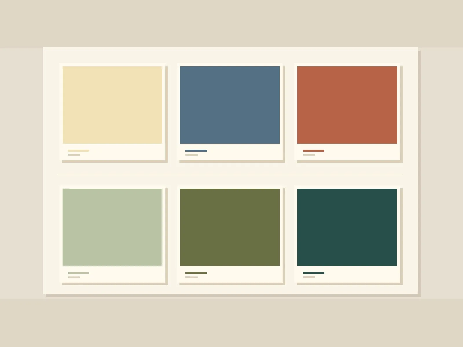
For a living room with timber flooring, try cream, muted blue and terracotta. Use cream as a backdrop, bring muted blue into a large piece of furniture and reserve terracotta for a lamp or cushion. Blue and terracotta evoke the complementary contrast between blue and orange.
For a reading corner, try light sage green, olive green and deep blue-green. Give the greens different values. If two samples are nearly identical in value, the chair can blend into the wall as the light fades.
Use 60–30–10 as a starting point: a dominant background, a supporting colour and a smaller accent. Judge the visual weight from the doorway. One saturated chair can draw more attention than a whole wall in a quieter colour.
Test your palette in six steps
- Write down which material, floor or fabric will stay.
- Prepare small swatches from both palettes and compare them beside the piece you are keeping.
- Move to larger samples and set them in the room, next to the material you are keeping.
- Look at them at two different times during daylight, then at night under the lamps you usually use.
- Step back to the entrance. Check that you can tell the main surfaces apart and that the accent shows up where you want it.
- Keep the combination that works across your usual lighting conditions. Save the sample names or codes so you can recreate it later.
Read colour in context
Two finishes that appear to match in window light may look different under a lamp. Before buying, look at the sample again under the light you use most. Associations between colour names and emotions showed shared patterns among participants and differences linked with linguistic and geographical proximity. The study measured associations with words. Its results cannot predict how a wall finish will affect mood. To decide how you want your room to feel, consider your preferences and how you use it.
Arrange the swatches in the Palette Explorer before testing the real materials.
Tools — Measure, compare and start with a clearer idea.
Sources and references
Color Matters — Basic Color Theory ↗17/11/2026
Benjamin Moore — Whole House Color Schemes ↗17/11/2026
Jonauskaite et al. (2020) — Color–Emotion Associations ↗Published research abstract · 17/11/2026
Datacolor — Color Management Questions ↗17/11/2026