





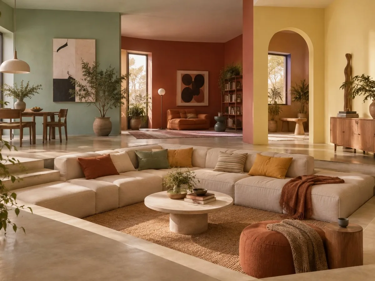
From showroom to imagined home
Opened in June 2024, Sabine Marcelis’s installation transforms the upper-level Loft at the VitraHaus into an environment conceived as if it were a home. Rather than arranging furniture primarily by designer or period, the design brings together products from different eras and sources in a sequence of functional areas. Its central idea is to make the objects legible as part of a lived-in setting, not just as individual pieces on display.
Marcelis approached the commission by imagining how she would arrange the space if she lived there. That starting point shaped both the open-plan layout and the mixture of Vitra designs, her own work, and pieces by artists and designers in her circle. The resulting arrangement is a considered collage: the elements are connected, but do not all have to match perfectly.
The VitraHaus itself is a showroom for the Vitra Home Collection, with rooms arranged in different styles to help visitors explore furniture and consider it in relation to their own homes. The Loft takes that domestic premise further. Its furniture, materials and artworks are composed to suggest a home with a particular character, rather than a single, uniform product display.
Colour gives the open plan a structure
Colour is the main device for distinguishing one functional area from another. Each area has a base hue, so the large, open space reads as a succession of places rather than as one undifferentiated room. The palette is organised around tones Marcelis chose intuitively and personally, drawing on colours used in her studio and adding other hues to bring the arrangement together.
| Area | Base colour | Role in the arrangement |
|---|---|---|
| Lounge | Caramel | Establishes a warm, enveloping zone |
| Kitchen | Rusty red | Gives the kitchen a distinct, earthy tone |
| Living room | Green | Marks the area around the conversation pit |
| Workspace | Very light yellow | Differentiates the work area with a pale hue |
The installation also uses cooler accents, including green and pink, against an overall warm palette. The aim is not to make every object coordinate exactly, but to create enough visual connection for different pieces and areas to belong to the same interior.
Colour here does more than decorate surfaces. It helps visitors recognise where they are within the open plan and gives each zone a distinct atmosphere without relying on physical walls to separate it. This is a useful distinction for anyone thinking about an open room: colour can contribute to spatial organisation, but it does so through visual cues and atmosphere rather than by creating an actual enclosure.
Marcelis’s preference for colours she does not tire of also points to a different way of choosing a domestic palette. Instead of treating colour as a response to a particular year’s trend, the Loft uses personal favourites intended to feel lasting to their maker. That is a point of view, not a guarantee that a colour scheme will remain timeless for every occupant; its practical value lies in beginning with a person’s own sustained preferences rather than an assumed trend cycle.
The sofa becomes a place to gather
A central feature of the living area is a conversation pit made by joining modules from Jasper Morrison’s Soft Modular Sofa. The system is commonly arranged in an L shape; here, its components are brought together to create a more enclosing arrangement.
That change affects how the sofa reads within the room. Rather than a row of seats oriented mainly along an edge, the pit forms a shared centre: people can sit facing one another within the arrangement, and its enclosing shape helps distinguish the living area from the larger open space around it. The installation is also intended to invite visitors to linger, with films projected onto surrounding walls and panoramic views available from the seating area.
The example illustrates a broader possibility of modular furniture: its components can be arranged to support different patterns of use, not only different numbers of seats. A more enclosing layout may encourage conversation and a sense of gathering; a straight or L-shaped arrangement may serve other needs. The right configuration depends on the room and how its occupants want to use it. The Loft demonstrates one approach, rather than establishing a universally suitable layout.
Marcelis describes a lounge pit as the core of her own home as well as of this installation. In the Loft, that personal reference helps the furniture function as more than a product display: it gives the room a social focal point and a reason to pause.
A home-like collage of objects and artworks
The installation combines Vitra pieces with objects and artworks from outside its main catalogue. Artists and designers including Maria Pratts, Saskia-Noor Van Imhoff, Johnny Mae Hauser and Carlijn Jacobs contribute work to the mix. Berlin-based artist and pattern designer Ehsan Morshed created special bed sheets for the Loft, using his practice of building unexpected patterns through collage as a source for the textile design.
The combination of furniture, artworks and customised elements gives the interior more than one visual register. Instead of making every piece conform to a single style, the arrangement lets items with different origins and characters sit alongside one another. Marcelis’s stated aim is to give the project a sense of personality through pieces that can carry their own histories and meanings.
The Loft also includes designs from Artek alongside Vitra products. This broader mix supports the idea that a home need not be assembled as a single-brand collection. Its coherence can come from relationships among objects—their colours, materials, placement and personal significance—rather than from uniformity of manufacturer or period.
This approach can be useful when planning a room, but it does not mean that adding artworks or objects automatically makes a space feel personal. In the Loft, the effect comes from deliberate selection and arrangement, with colour and furniture providing a framework for the more varied objects.
Limited-edition objects extend the colour scheme
The installation also gave rise to limited editions of two designs by Verner Panton: the Panton Chair Classic and the Visiona Stool. The chair was offered in a high-gloss finish in the seven hues used in the Loft’s palette. The low, cylindrical stool was offered in seven limited-edition colours with a range of upholstery covers, from furry textures to leather.
Both editions were limited to 50 pieces per colour. The products carry the installation’s colour scheme beyond the room, turning colour from a way of organising an interior into a feature of individual objects. They also connect the designed environment with products available for purchase. That commercial extension is part of the project’s context, but it does not diminish the distinction between experiencing a room and owning one of its objects: the palette can be encountered as a spatial system in the Loft, or as a finish on a particular chair or stool.
Practical ideas for arranging a living space
The Loft offers several approaches that can be adapted to residential interiors, with the understanding that its specific layout and colour choices are one designed example rather than a universal formula.
- Use colour to make zones easier to read. In an open-plan room, related colours can help distinguish areas for lounging, working or cooking without making them feel entirely separate. Colour defines a visual boundary, not a physical one.
- Configure modular seating around an activity. Consider whether the arrangement should support conversation, relaxation or another use. A more enclosing layout can create a shared centre; the standard configuration is only one possible starting point.
- Mix objects with different origins. Furniture from different makers, artworks and personal objects can form a coherent interior when their colours, materials or meanings relate to one another. Matching everything is not the only route to cohesion.
- Start with colours you expect to live with. Personal preference can be a more durable basis for a home palette than a short-lived trend, although no colour is inherently timeless for everyone.
- Treat the room as an arrangement, not a catalogue. The Loft’s domestic character comes from the relationship among furniture, textiles, artworks and zones, rather than from any one object in isolation.
At a glance
Scope
Editorial reading; this does not constitute a visit or a technical assessment.
Sources and references
VitraHaus Loft | Official Vitra® Online Shop ES ↗23/10/2026 VitraHaus Loft: A conversation with Sabine Marcelis — Interview on the designer’s approach, colour choices, furniture arrangement and collaborators; published 27 May 2024.
VitraHaus | Official Vitra® Online Shop ES ↗23/10/2026 VitraHaus — Overview of the building’s role as a showroom for the Vitra Home Collection and its presentation of rooms in different styles.
VitraHaus Loft de Sabine Marcelis | Official Vitra® Online Shop ES ↗23/10/2026 VitraHaus Loft by Sabine Marcelis — Installation details, opening date, collaborators and limited-edition products; published 15 May 2024.